Client Freelance Work
KATHRYN
KING PHOTOGRAPHY
Building a Brand.
A friend connected me with Kathryn King when she was looking for help with design and social media management for her photography business — and it turned out to be the perfect creative fit. From our first conversation, I wanted to start with the foundation: building a cohesive brand identity that matched her elegant, natural photography style.
I created quick but thoughtful brand guidelines with curated fonts, colors, and layout inspiration to bring consistency across her social media and marketing materials. Kathryn’s work already speaks for itself — my goal was simply to highlight it through clean, elevated design that feels timeless and true to her brand. Using her favorite blues and greens, I developed a simple, elegant aesthetic that enhances her visuals rather than competes with them.
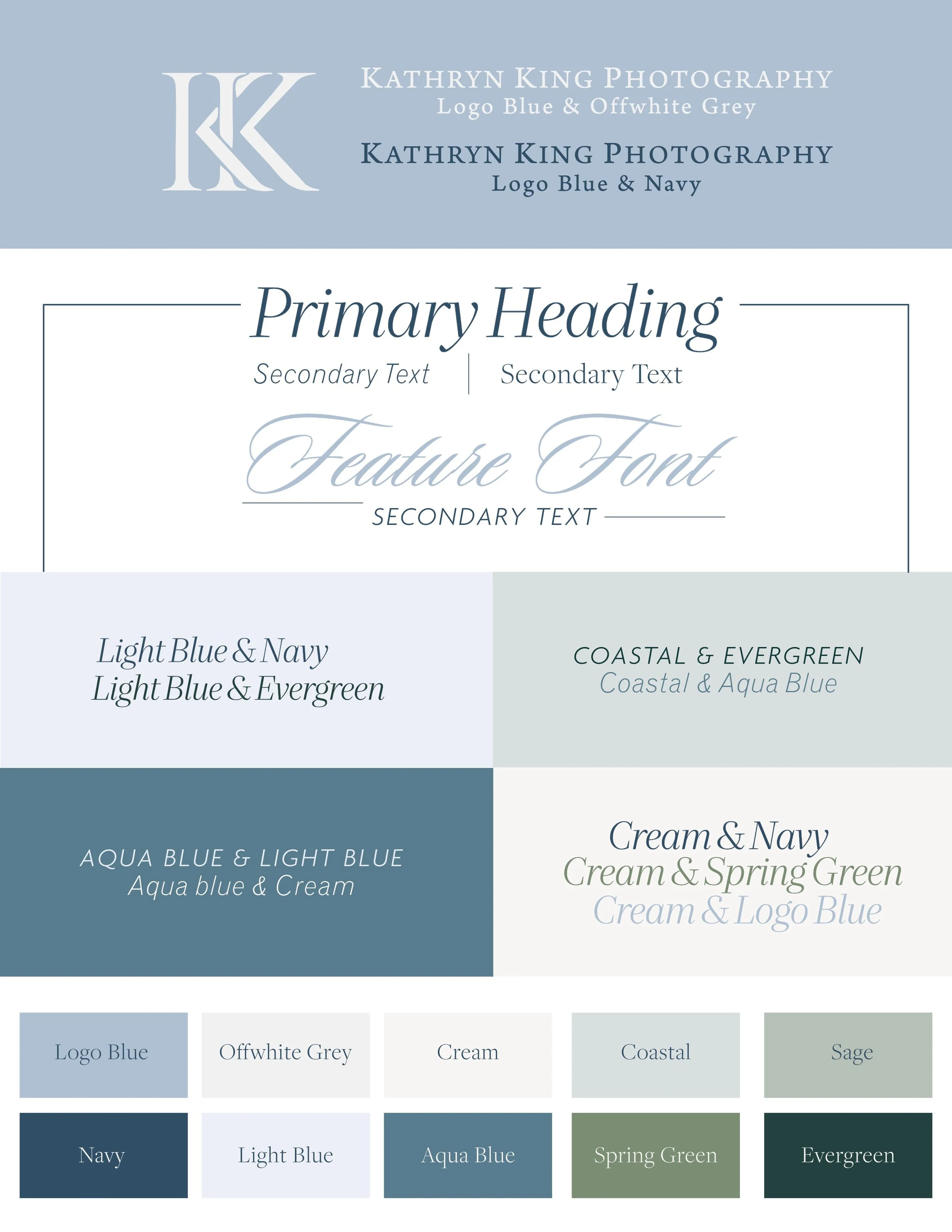
Bringing it to life.
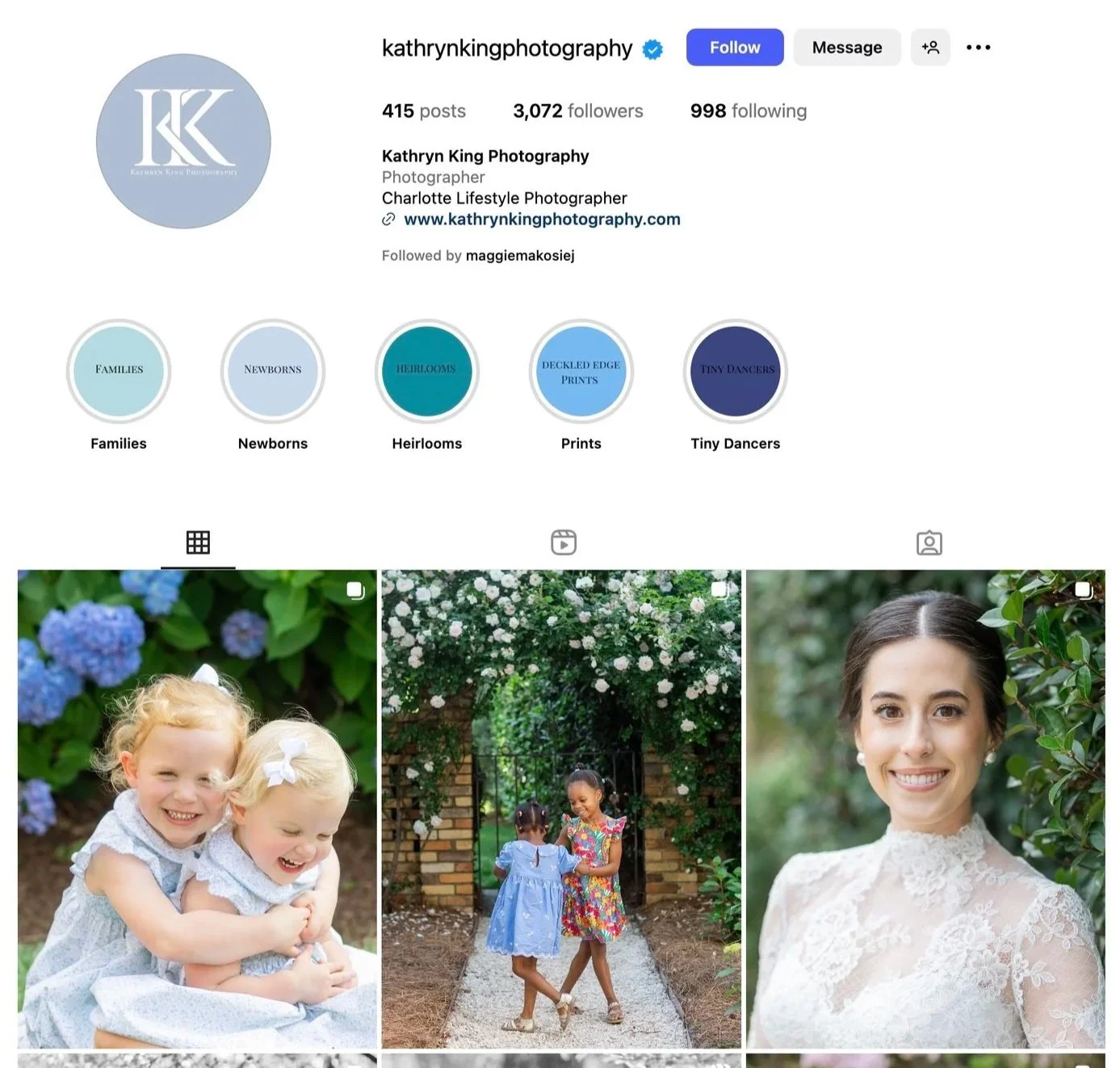
Next steps included applying the new brand identity across Kathryn’s social media. I refreshed her feed, created story covers, templates and cohesive layouts that carried her elegant, timeless style into every post — bringing consistency and personality to her online presence. Check out that before and after!

After refining Kathryn’s brand identity, I conquered applying it to her marketing materials — starting with the client flyers she regularly sends out. I redesigned them using her updated fonts, colors, and photography to create a cohesive, elevated look that aligns with her brand. The new designs feel clean, professional, and true to her timeless style while enhancing the overall client experience, and are definitely an improvement! See a couple before and afters, and the final products below!
BEFORE


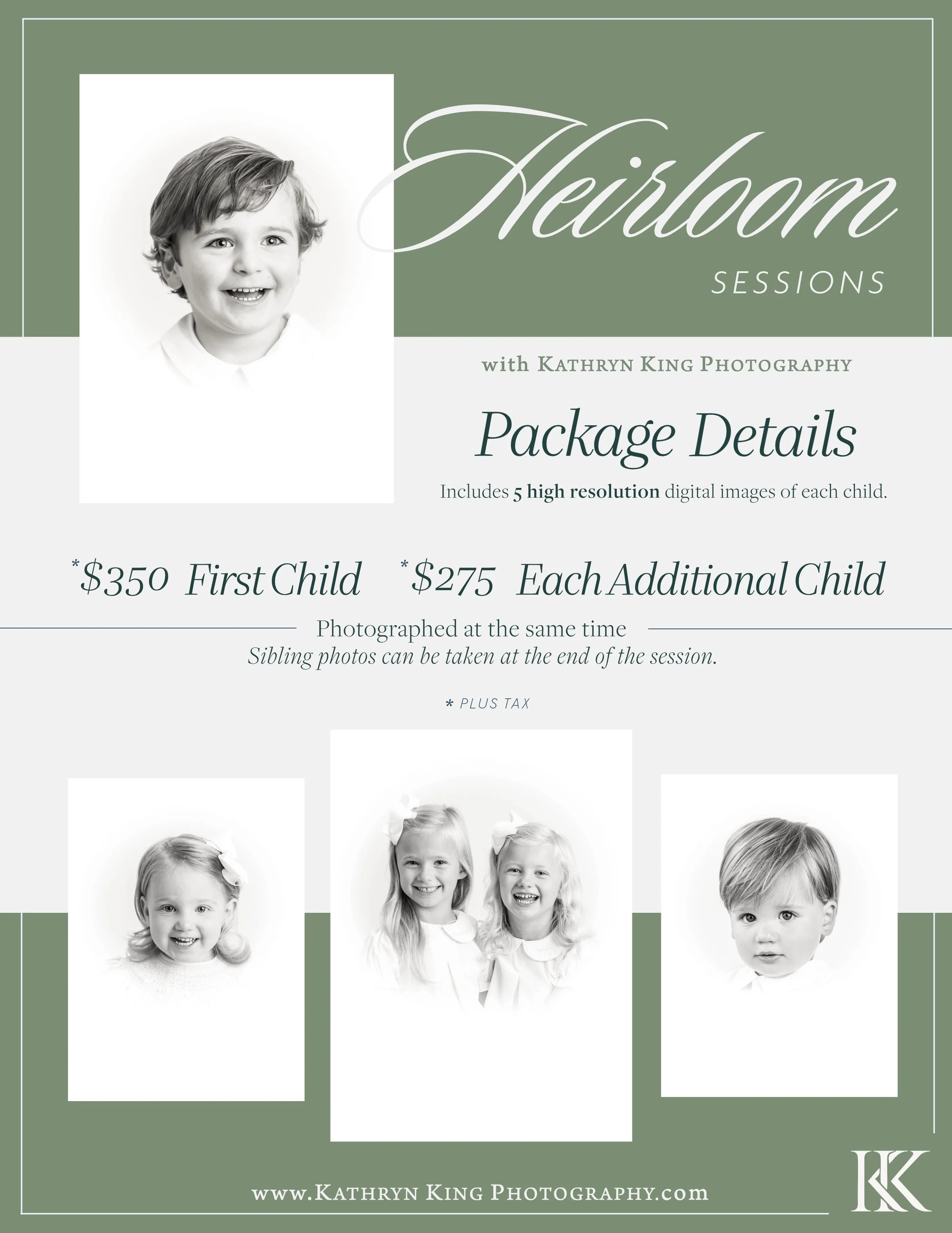
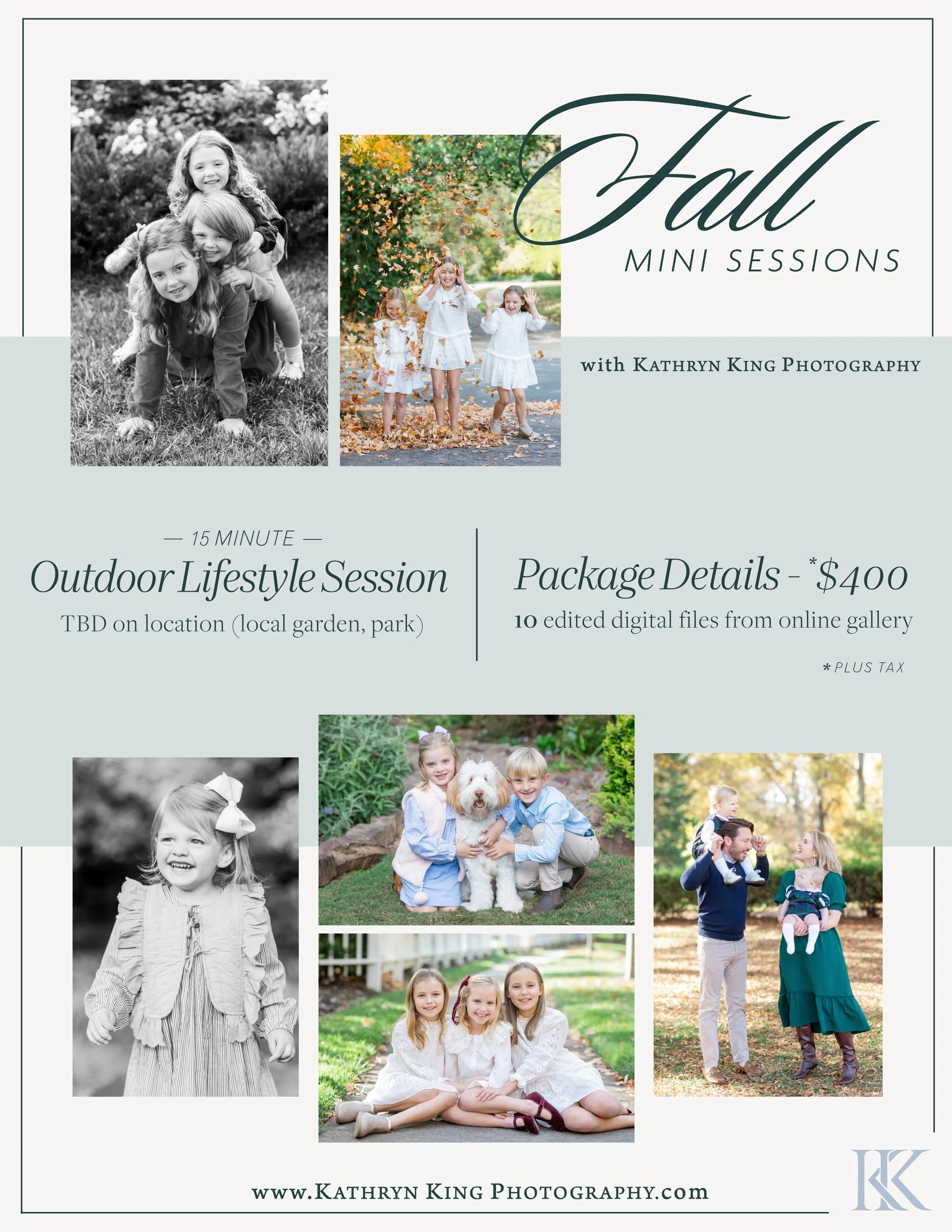
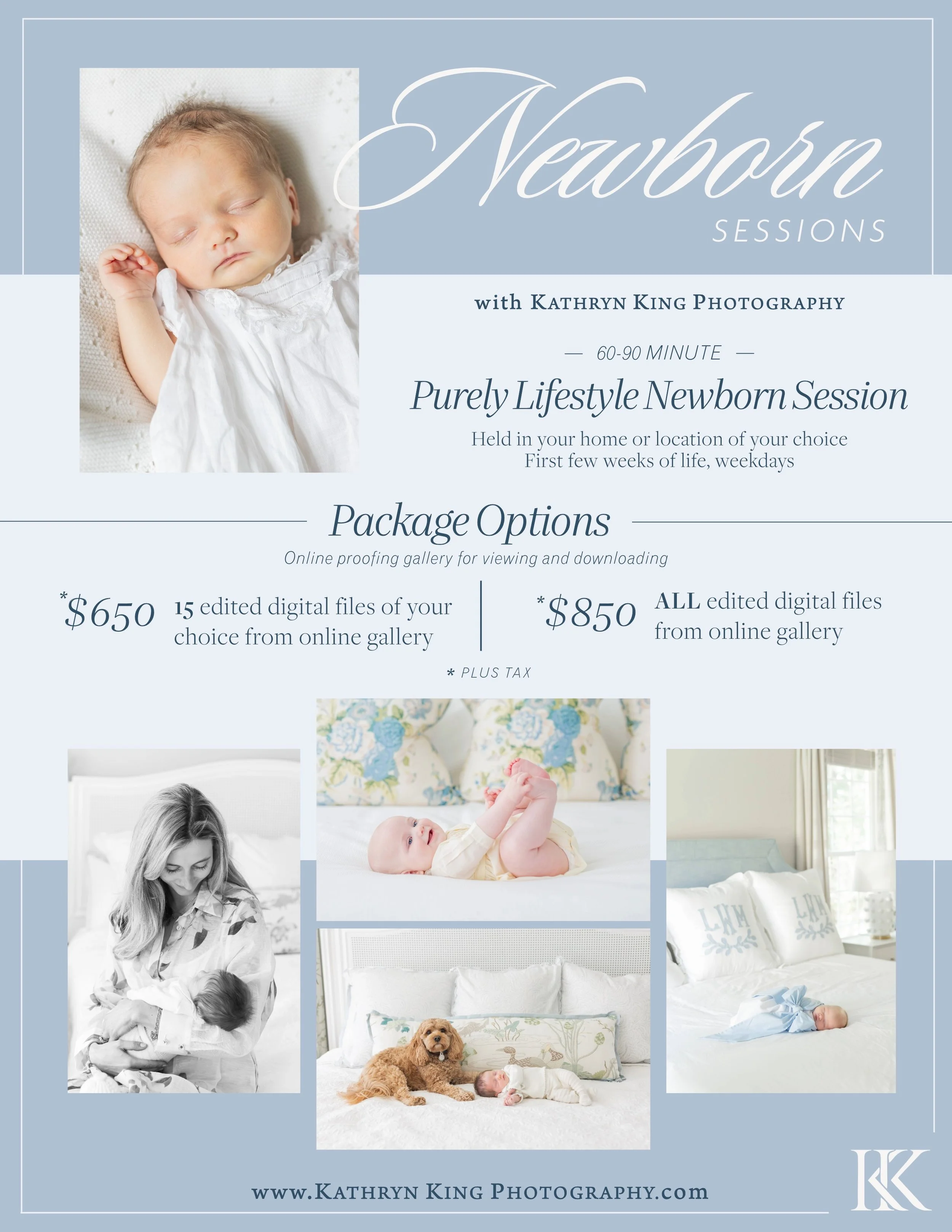
AFTER

Out with the old, in with the new.
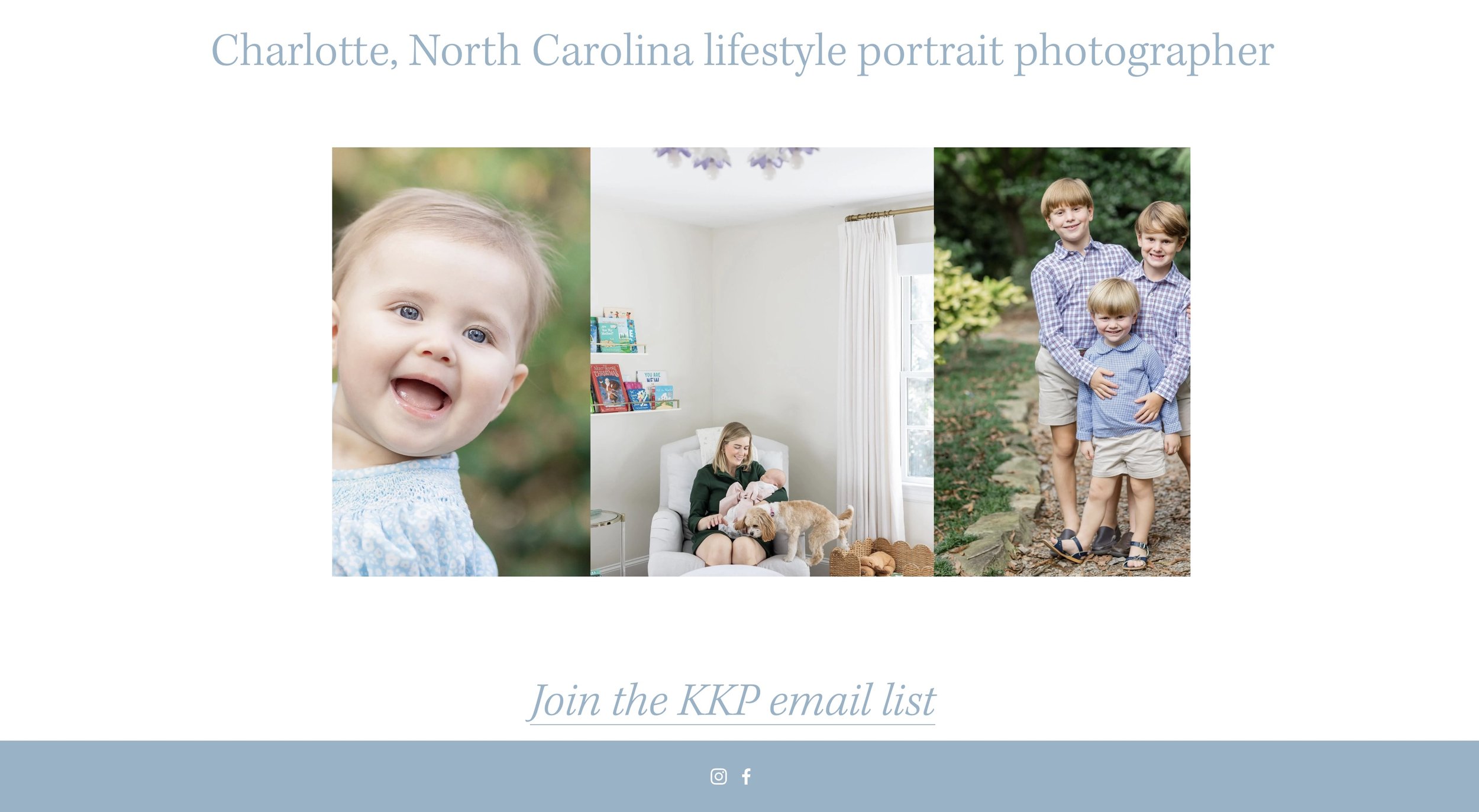
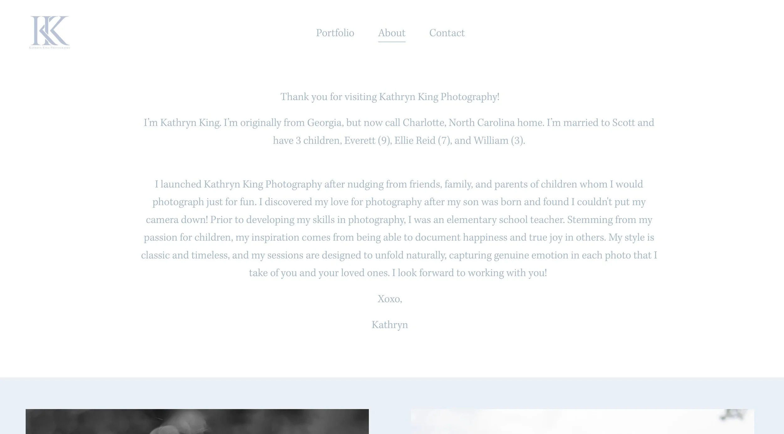
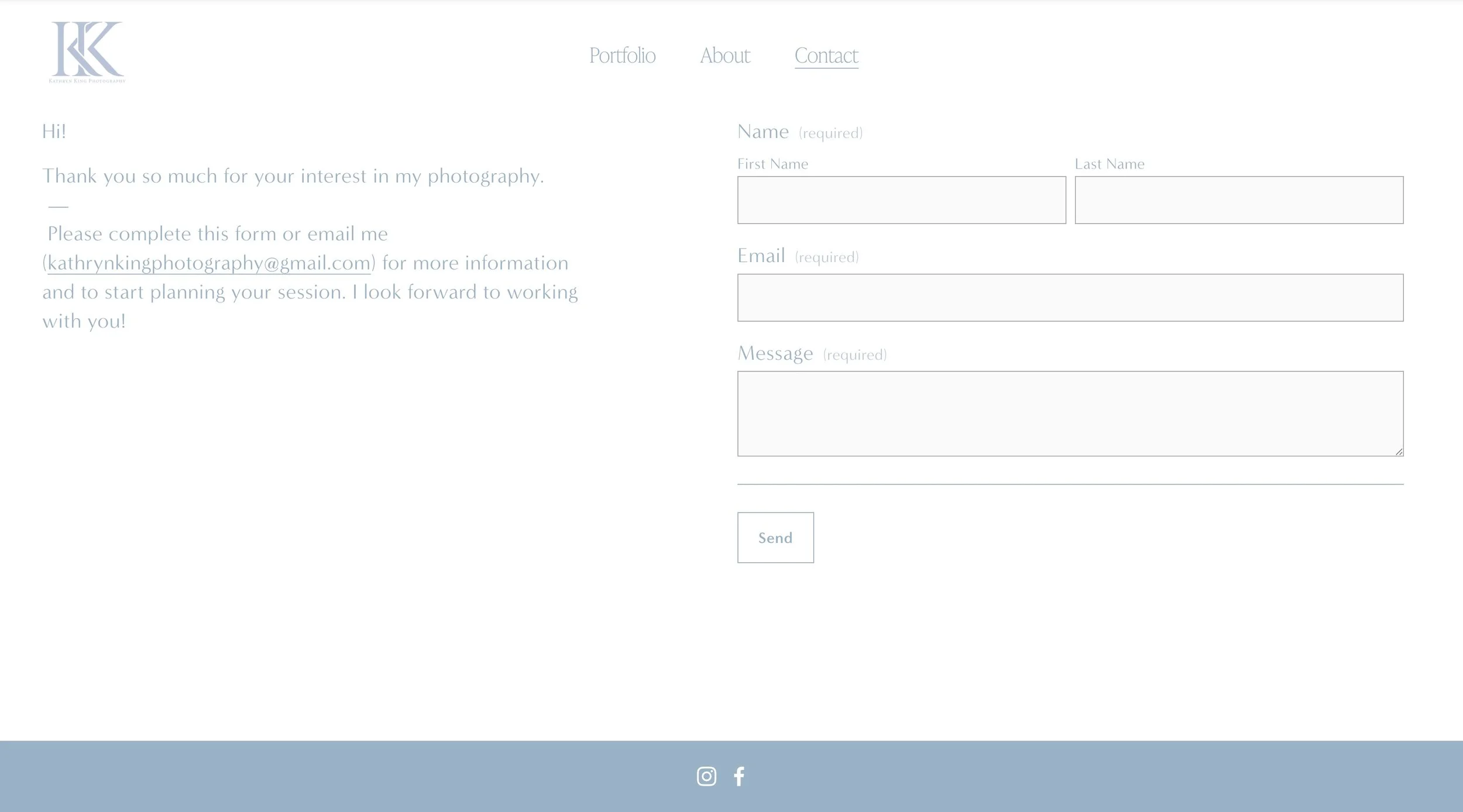
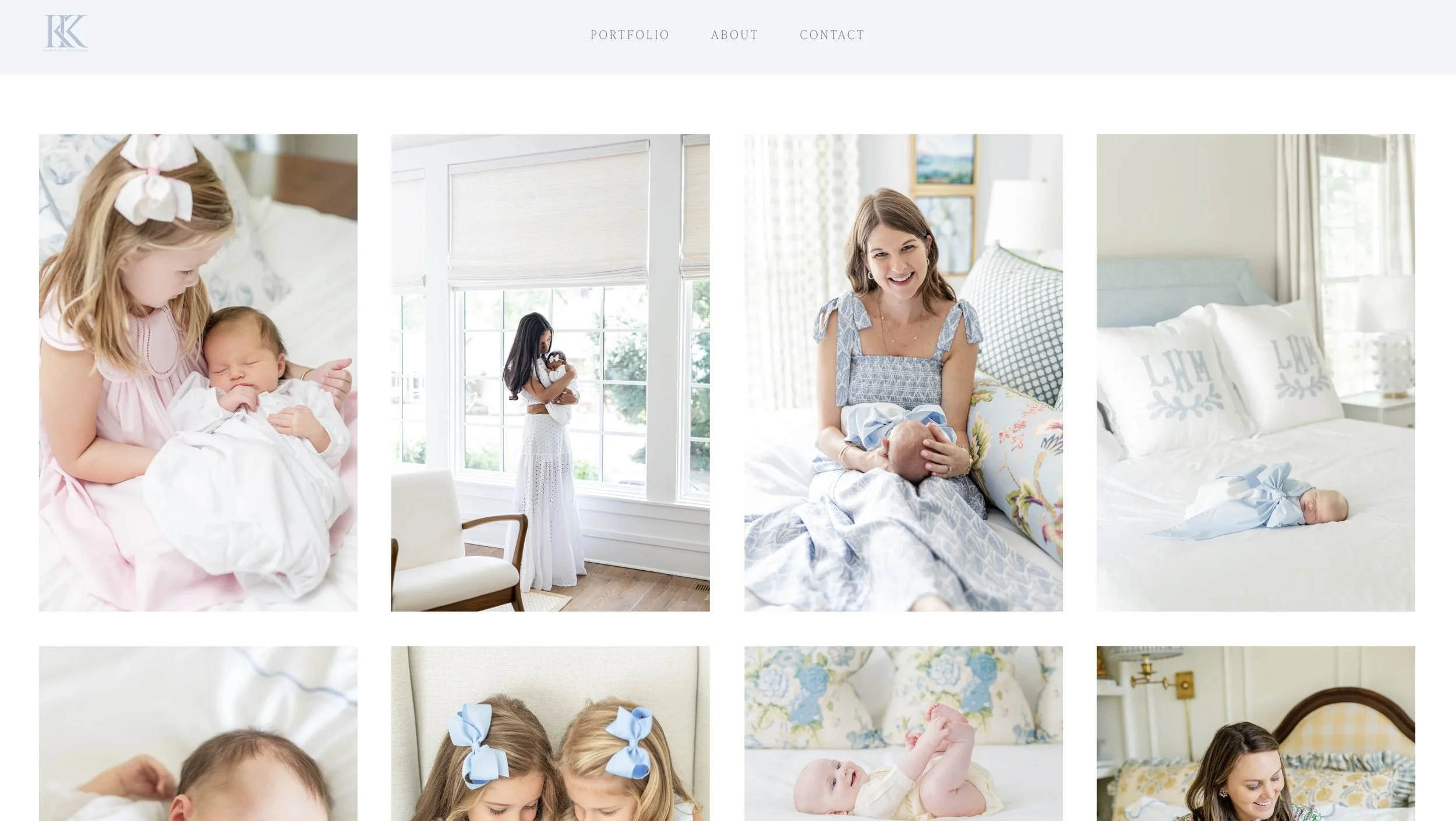
I redesigned Kathryn’s Squarespace website to better reflect her refined brand identity and create a more professional, elevated online presence. This included selecting modern fonts, applying her brand colors consistently, and reorganizing content for clarity and flow. I also optimized SEO titles, image sizes for faster page loading, and ensured layouts worked seamlessly across both desktop and mobile. This project taught me a lot about effective website design, from visual hierarchy to responsive layouts, and how small adjustments can make a big impact on user experience. See the before and after below!

Before - Home
Before - About
Before - Contact

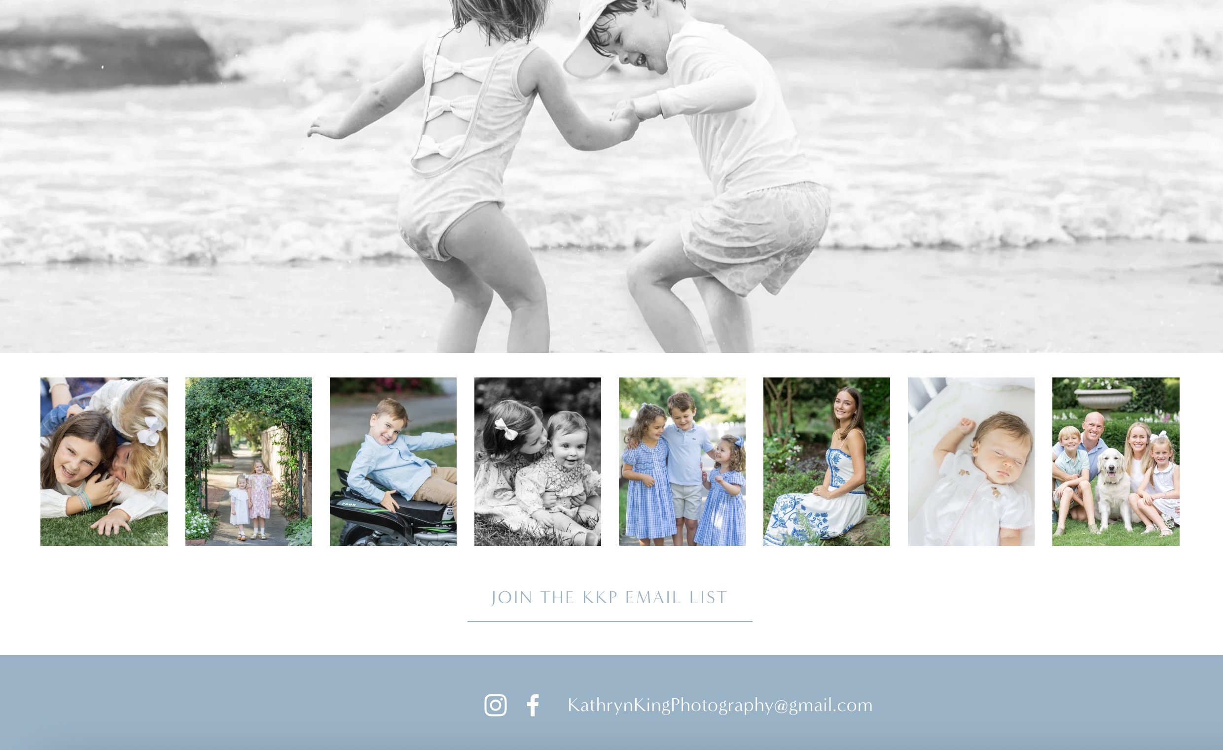
Before - Mailing List

After- Home
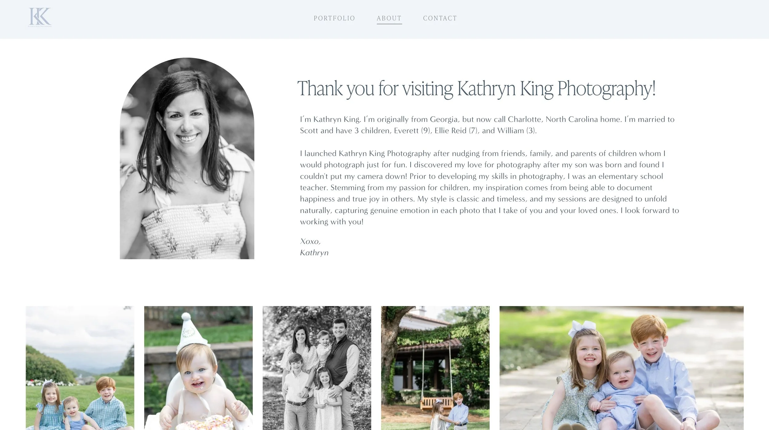
After - About
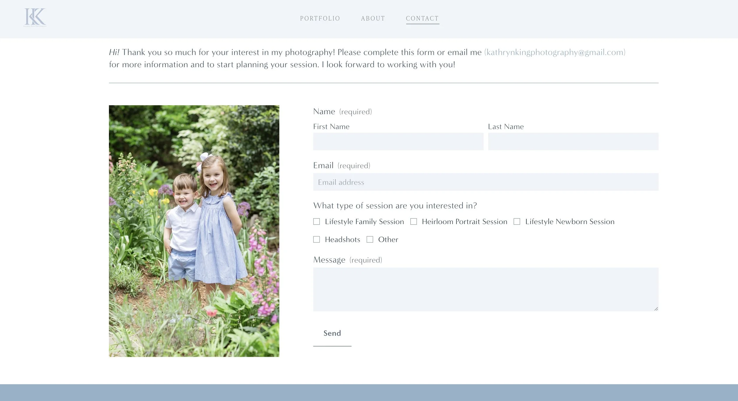
After - Contact

After - Mailing List
After - Home
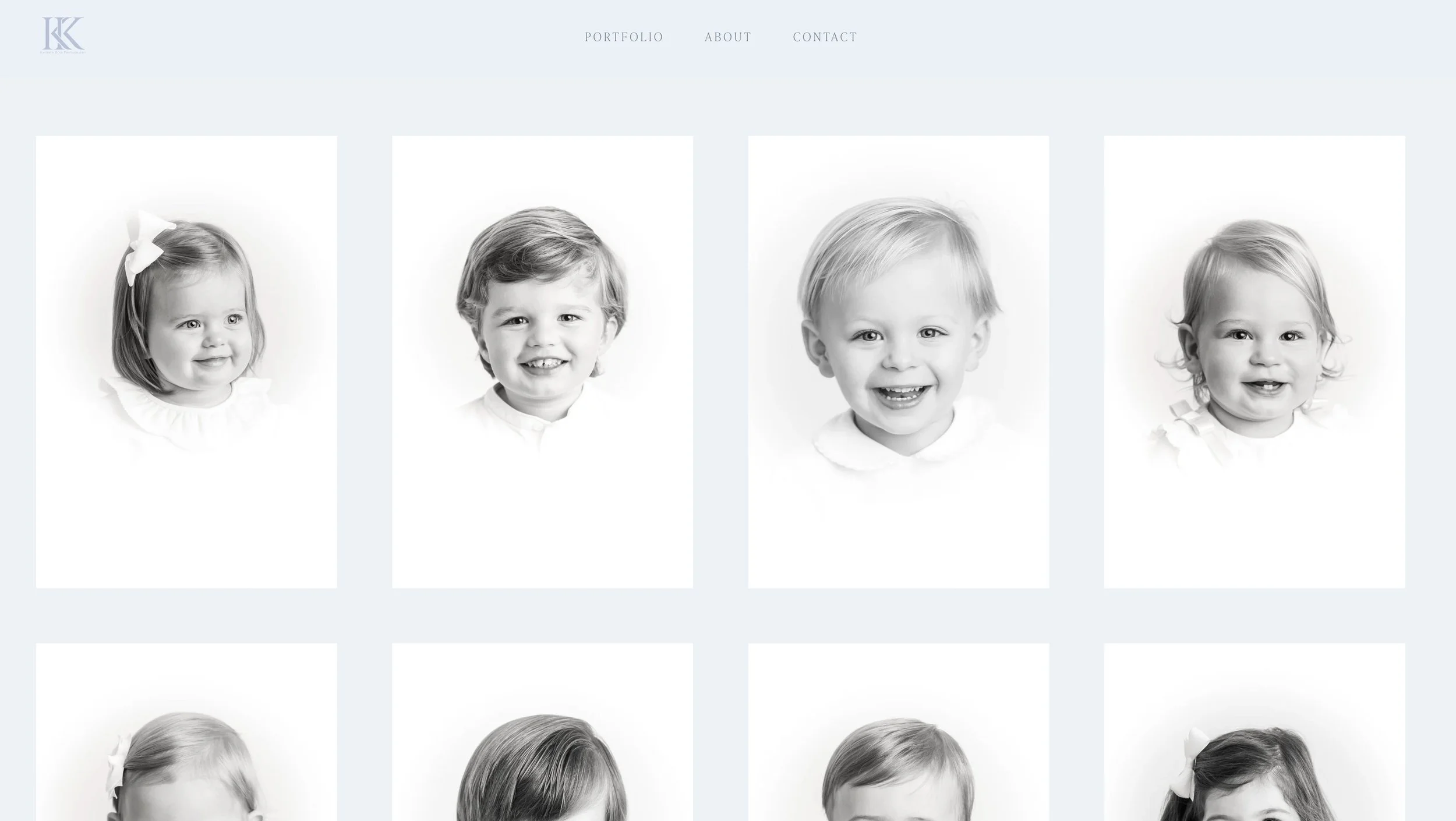
After - Portfolio - Heirlooms
After - Portfolio - Newborns
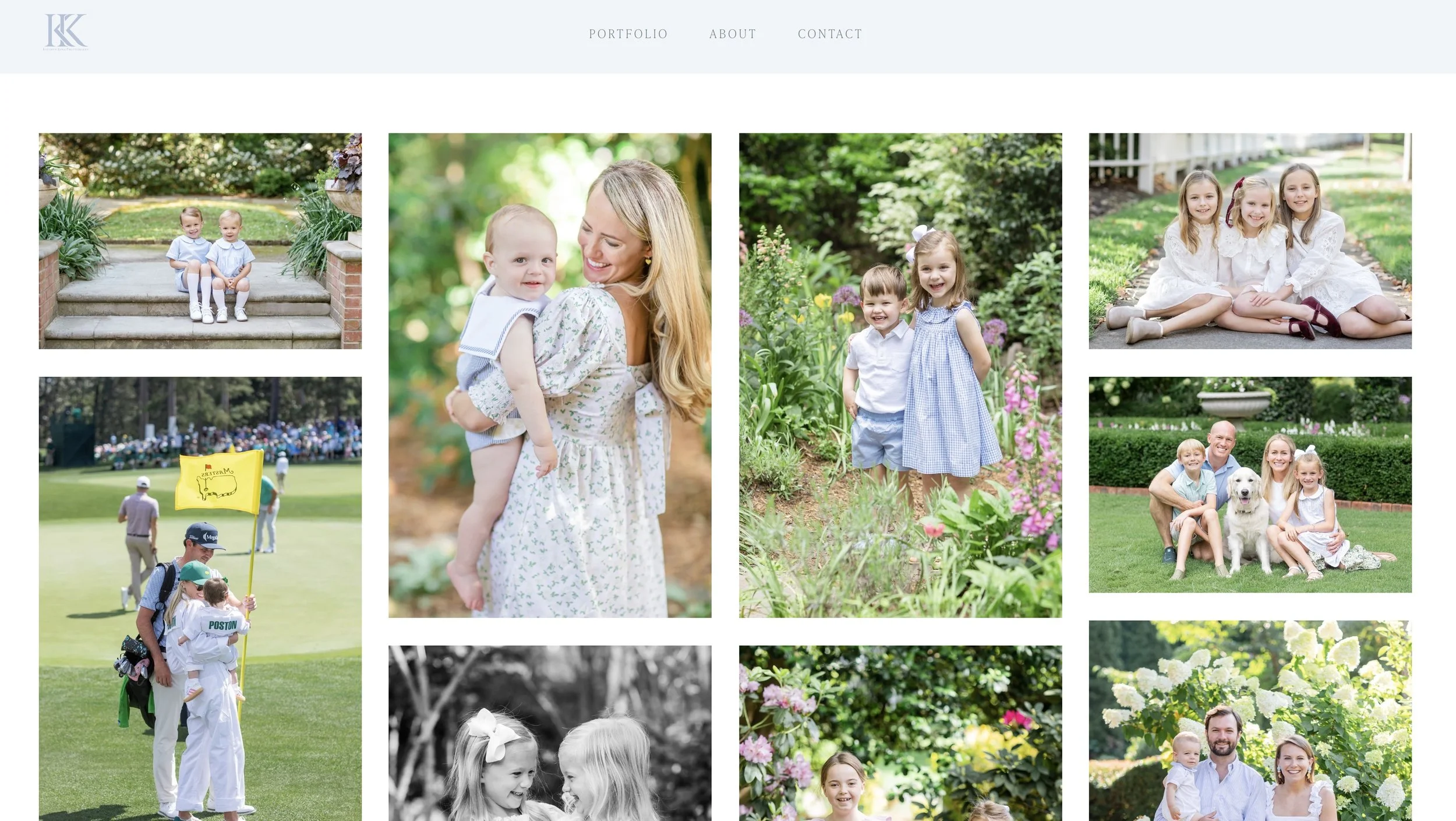
After - Portfolio - Families